The human brain is a machine for coming to conclusions; if it cannot come to conclusions, it is rusty.
-G.K. Chesterton
Part of the movement and production of art is critique. To open oneself up to outside criticism from peers is not just a method of moving forward, but is practically a virtue. The humbling process of allowing another to deconstruct something that you have spent hours constructing is frustrating, humbling, and insightful all at the same time. Our logo, as a reflection of our ministry, is also open to the same humbling and uplifting critique that can be found in the long history of peer review and examination. Don’t get me wrong. I’m not trying to make any more of a simple critique than needs be. Sometimes it is mean spirited, envious, and annoying. But even in those situations, it can still be productive.
 Our old logo has been with TF since it’s inception, over 5 years ago now. It was originally designed by an outside freelancer who works out of Montgomery. Albeit before my own time, it was crafted to emphasize the original intent of the ministry. Symbolic of a specific target, embedded within the cross, this was and is the high mark of all christians, and the goal and purpose of our faith. A Christ centered ministry that focuses on uplifting the Church in ministry, theology, philosophy, and apologetics.
Making no bones about it, we are a ministry aimed at Christian churches in the south, and specifically in Birmingham. Our emphasis is local. We are and have been committed to Christian orthodoxy, in the smallest sense of the “o”. In this way, Tactical Faith has not changed, and God willing, we will not change.
 With all that in mind, when we decided to change the logo, it was with the orthodox mindset in the lead. Our old logo, was contemporary, and modern. It was also commonly confused with a medical distribution organization, which as a salve, works. We do wish to heal the church in a way that brings theological renewal. But in the end, we felt that we needed to emphasize the ancientness of the faith that we long to represent. As such, we wish to spread wide the arms of the cross to all christians, regardless of denominations, tertiary theologies, and minor differences in the interpretation of scripture. All these things are important, but as a non-profit, this is not where are emphasis is. It is with anyone willing to align themselves with the Cross of Jesus Christ. The Cross and all its immediate emphasis in salvific history was a first priority in crafting the new logo.
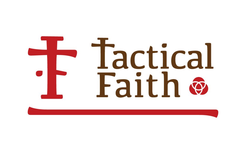
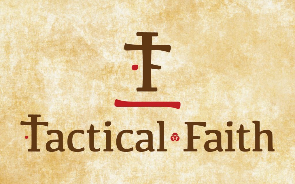
 I felt compelled to combine the T and the F into a single typographical element. This is not always meant to be a stand alone symbol, but it is meant to be an independent component when needed. As this cruciform began to take shape, I felt it only natural for the arm of the F to represent the spear that penetrated the side of Jesus. However, this also left me with a graphic issue of empty space on the other side of the F. Wanting to balance out the dead space I set to work on a solution. As most readers of the Gospel know, when the spear did penetrate the side of Jesus, it poured forth both blood and water. The historic implications of this description have validating medical overtures, since the heart will form a sack of fluid when under duress. As the blood of Christ is crucial to the work of the cross as well as the historical significance of this particular point in the narrative, the balanced solution was obvious. A
 ![]() single drop of blood reflected on the opposite side of the spear/arm would give the composition proper weight on both sides. Once that problem was solved I again felt compelled to further the logo into the Cruciform. As such one would have to consider all aspects of the Cross from a historical perspective. That would be the apologist in me coming out. As such, I decided to add an ascender to the logo. One in which would possibly carry the impetus of the crucifixion. “King of the Jews”. It says
single drop of blood reflected on the opposite side of the spear/arm would give the composition proper weight on both sides. Once that problem was solved I again felt compelled to further the logo into the Cruciform. As such one would have to consider all aspects of the Cross from a historical perspective. That would be the apologist in me coming out. As such, I decided to add an ascender to the logo. One in which would possibly carry the impetus of the crucifixion. “King of the Jews”. It says  everything about the work of Jesus. The sign that was hung above Christ’s head. Being labeled an insurrectionist and a blasphemer, it is commonly understood that Pilate saw thru this ruse put on by the Jews. And to make it clear that insurrection would not be tolerated, Pilate placed this sign above Jesus as a tongue in cheek declaration of His “crimes”. What more justification would I need for the ascender? None at all. While not being as overt as the arm for the F, it still serves a symbolic purpose, which I’m happy to point out, since it gives preeminence to the One whom we serve. As for the other components of the logo, it is typeset with the font Kefa Regular. The T in Tactical has been replaced with the cross, without the arm and drop designating the F. The line of red below the TF logo represents the blood that covered the earth when Jesus spilt his blood. The brown and red represent the aforementioned blood, and the earthiness of Christ’s ministry. Lastly, I used a small bullet in the shape of the trinity, to further emphasis the specific type of ancient Christianity that we are seeking to promote.
We are mere christians. We are orthodox. We are ecuminical in the purest form of the Gospel. It’s what we do. Hopefully this will come thru in our messaging and our actions.


